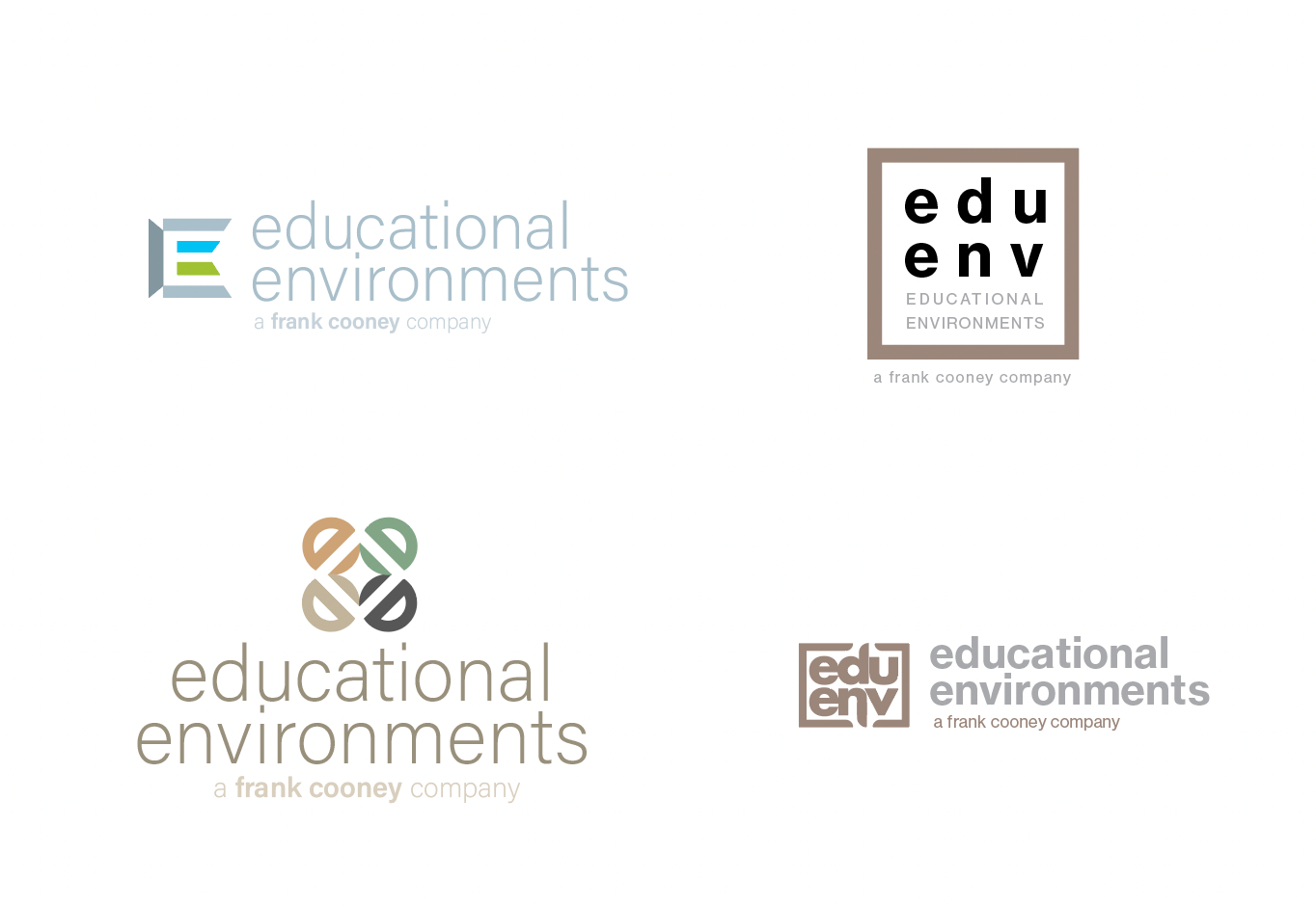
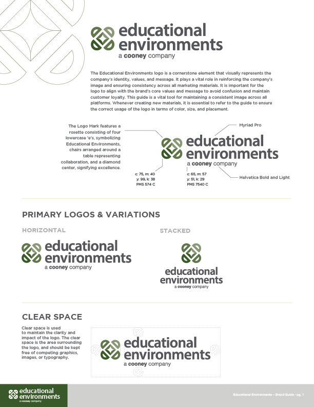
This logo was developed for Educational Environments, originally The Frank Cooney company founded in 1967. Having evolved into specializing in institutional and educational environments, a brand refresh was required to better align with their current clients, while keeping Cooney company in the name to support their heritage and existing brand recognition.
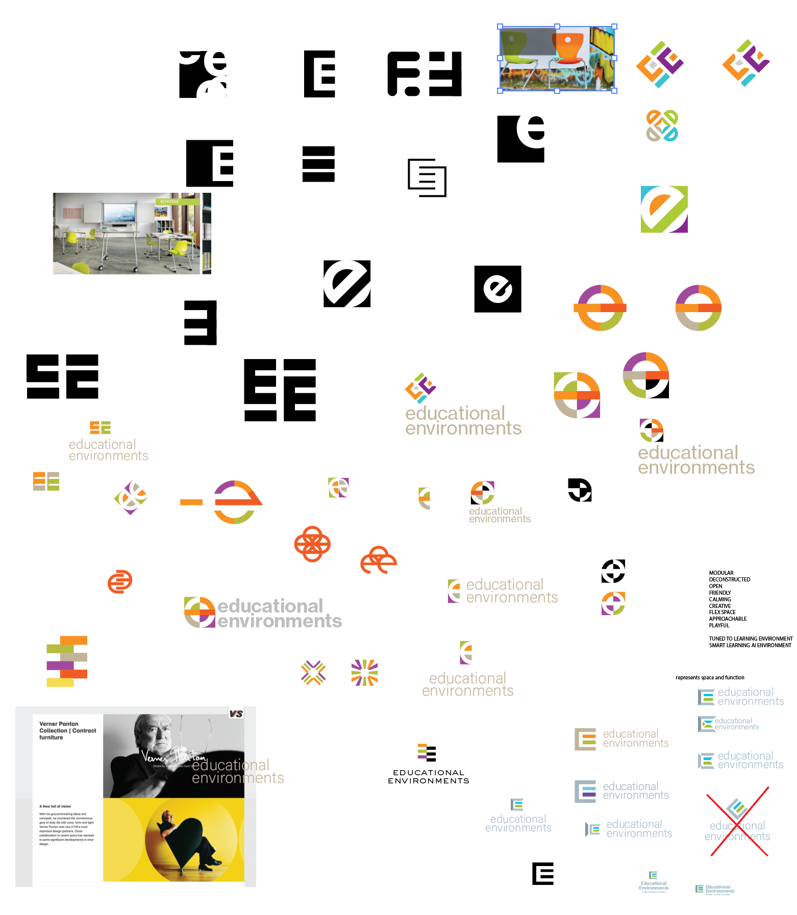
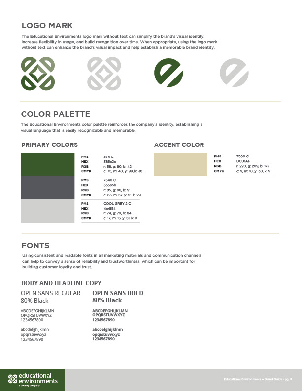
The logo Mark consists of four lowercase letter E's, arranged in a square configuration giving the appearance of office chairs and a table, suggesting collaboration and working environments, while the diamond shape center evoks a sense of quality and excellence.

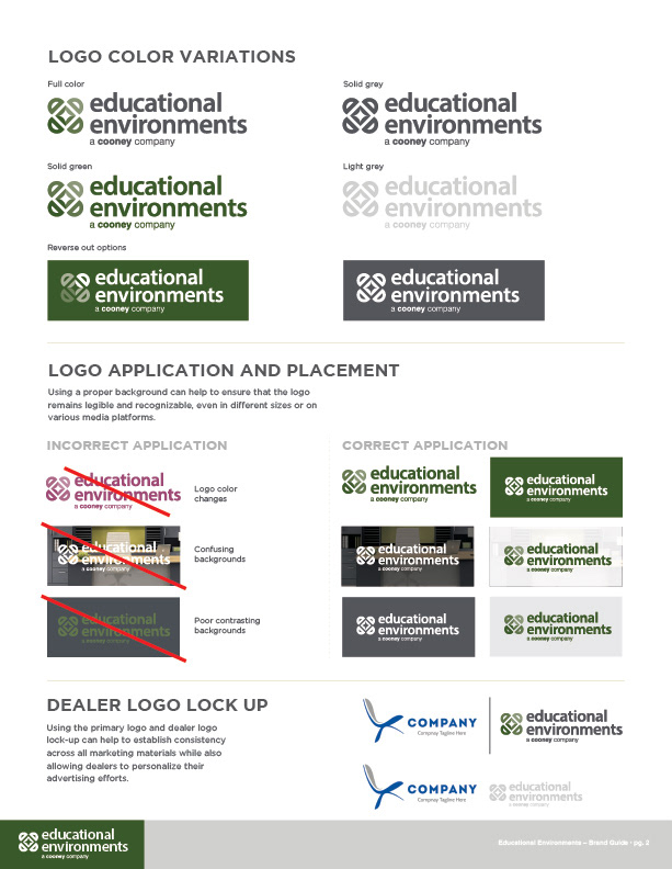
A brand guide was developed to help the client ensure consistency across all marketing efforts.

Several rounds of concepts were generated for client review and feedback.